My Blog for your Knowledge

We'll make sure your website works for you...

The Road to Web designing

Art Illustrations

Do you want to look great?

Showing posts with label Mobile Wap. Show all posts

7 September 2011

Changing Blogger Mobile Template

The Blogger Mobile templates is something pretty cool, and blogger provides you with 27 mobile templates to choose from. You cannot completely customize the mobile template(as of now) but you can pick any of the available templates.
All of these templates come with Post Thumbnails, and a custom excerpt rendered using the data:post.thumbnailUrl and data:post.snippet variables. These templates also support the swipe navigation. You can swipe left and right to move across pages on your Touch screen mobile
Here is a preview of how this Blog looks on a Samsung Galaxy S2
bloggerplugins.org_on_sgs2
Lets see how we can change the blogger mobile template
1. Login to Blogger in Draft : http://draft.blogger.com
2. Go to the Template Section
image
3. Click on that button below the mobile version
image
3. From the next screen you will be able to enable the mobile template, and select the template which you like. Use the dropdown and the slider to pick the perfect template
image
4. When you are done selecting the template, Click the Save button.
You might have noticed a QR code on the Template Selection Screen. Scanning this from your mobile will take you directly to the mobile version of your blog.
If you visit your blog from your mobile, you should be automatically taken to the mobile version of your blog.

27 February 2011

Simple iPhone Application


Simple iPhone App – CodeCanyon


Simple iPhone Application

Check out this Appcelerator Titanium iPhone template! – Simple iPhone App is an iOS template built on Appcelerator’s Titanium. It is designed for web and mobile app development agencies or designer portfolios. Because of it’s flexibility you can also use it for showcasing other web or mobile apps. Add as many tabs as you want to create a full personal portfolio on the iPhone!

All javascript files are well commented and sectioned off in a way where you can cut and paste certain elements and implement in to your own project. Photoshop .psd files are included to build your own pages.


13 January 2011

Mobile Templates available for Blogger

Although our Blogger sites can be viewed on most mobile devices, it can be difficult to effectively read blogspot sites due to the small screen size.

To enhance our readers experience of Blogger blogs when viewed on Smartphones (and similar devices), the Blogger Team have enabled Mobile Templates as an opt-in setting through Blogger in Draft.

Mobile Templates reformat the appearance of our blogs to include:
  • Blog Title
  • Recent posts with thumbnails and a preview snippet (which are linked to their item pages)
  • Links to read the standard version of the site
  • Mobile Ads (where the blog owner has chosen to display Ads beneath posts or in the sidebar)
  • Comments (including avatars), scaled images and videos
If you have chosen to use Blogger Pages and have added a Page List gadget to your template, this will be shown in the position it appears in your site.


Which templates are supported?

At present, six variants each of the Simple and Awesome templates are available as Mobile Templates. If you're using one of these Blogger Template Designer templates, the mobile version of your site will appear styled in the same manner as when viewed on your desktop.


If you use a different, third party or customized template, the mobile version of your website will adopt the Simpletemplate appearance.

I'm pretty sure we'll be able to customize the appearance of our Mobile Templates by adding custom CSS, which I'll write about in a future post once I've experimented a little.


How to enable Mobile Templates for your blog

Currently Mobile Templates are an experimental feature available through Blogger in Draft to which we must opt-in.

Log in to your Blogger dashboard via Blogger in Draft, then go to Settings>Email and Mobile.

Near the top of this page you'll see the new option available to enable mobile templates for your site, along with a preview link and QR code (so you can preview on your own mobile device):


Check Yes to enable Mobile Templates, then scroll down to the bottom of the page and click Save.

Once you've saved this setting, anyone who visits your website using a mobile device will be automatically redirected to the mobile version of your website.


What do you think

Do you like the new Mobile templates, and have you enabled them for your own Blogger site?

Please feel free to leave your comments and opinions below.

25 March 2010

Better Mobile Form Design

Trust me, no one likes filling in forms —especially on mobile devices where one-handed, on-the-go data input and slow connections are common place. As a result, designing forms that make mobile input faster, easier, and less error-prone is crucial. Here's a few ways it can be done.

To illustrate, let's look at two mobile forms for booking a hotel: one from the Expedia mobile Web site, the other from the Kayak iPhone application.

Expedia's mobile Web site has made several modifications to the desktop version of their hotel booking form: the layout has been optimized for slender mobile screens; the "search near" set of options has been listed out; and the room count input uses a set of "+" and "-" buttons instead of a drop-down menu for input. Yet, there's still room for improvement.

  1. The form uses a free-form text input field that requires users to provide clarifying information on another screen if a mistake is made. And in many mobile contexts (fat fingers, one-handed typing, on the go) —mistakes do happen.
  2. The date selection field makes use of a calendar pop-up that requires people to tap a small ">>" target to advance to the previous or next month.
  3. The set of inputs for guest count uses (up to) three drop-down select menus for input, which require manipulating a list of options in a pop-up list.

expedia  mobile form

Kayak's mobile iPhone application also allows people to book hotels but it features a few additional mobile optimizations.

  1. Current location is available as a single click input in addition to a free-form text input. This allows people to search for hotels where they are now without typing.
  2. The free-form text entry field provides inline suggestions as you type. This not only reduces the amount of typing required (it only took me 3 characters to see Monterrey, CA), but it reduces errors as well. On the Kayak form, there's little need for the clarification screen Expedia requires.
  3. The date selection calendar allows people to use a simple scroll gesture to move between months instead of tapping a small target to change months. Users can just flick the calendar itself up or down through direct manipulation instead of having to use the ">>" control Expedia requires.
  4. The Kayak form doesn't use any drop-down menus, opting instead for "+" and "-" buttons that are easily tapped on a touch screen. (I'm not sure why Expedia uses these for room count but not guest count as both inputs only need to support a small number of possible values.)

Kayak  mobile form

In aggregate, these small enhancements go a long way to making forms on mobile devices faster and easier for people to complete.

17 March 2010

How To Market Your Mobile Application

App Store is a competitive environment. Against more than 140,000 apps, all screaming for attention, how do you make sure your app gets its time in the spotlight? What does it take to get good media coverage? How do you get people to talk about your app—and, ideally, how do you get them to buy it and show it to their friends?

How To Market your App

Following the simple rules laid out below, you will increase your chances in the battle for fame and glory. These tips might seem rudimentary or in-your-face obvious, but they are so often neglected in the heat of the moment.

Read more...

11 March 2010

Forms On Mobile Devices: Modern Solutions

Mobile forms tend to have significantly more constraints than their desktop cousins: screens are smaller; connections are slower; text entry is trickier; the list goes on. So, limiting the number of forms in your mobile applications and websites is generally a good idea. When you do want input from users on mobile devices, radio buttons, checkboxes, select menus and lists tend to work much better than open text fields.

Screenshot

But constraints breed innovation, and mobile forms are no different. The limitations of mobile devices have forced developers and designers to find new ways to allow users to input data faster and more easily. Thanks to the modern solutions covered in this article, the mobile space may not be a place to avoid forms much longer. Instead, it may become the place to encourage them.

Read more...

6 March 2010

How to create a mobile phone friendly website design

Have you ever had difficulties while surfing the web using your mobile device? Surfing the web on your mobile phone isn't the same as surfing the web on your desktop computer just because a mobile phone browser sees a website in a different way. The inconveniences are mainly caused by the size of the page that is much larger than your screen. And though more and more people tend to use their portable devices in order to access the Internet anytime and anywhere, still a great number of websites are not mobile friendly.

I have noticed that web masters mainly prefer to use simple HTML codes to make a website to be displayed more or less correctly on mobile screen. But the best solution for it is to create a separate content for mobile phone users, as YouTube and Google have already done it. As the market of mobile devices that are capable of accessing the Internet is constantly growing, this time I decided to write a tutorial on how to create a mobile phone website on the basis of a pre-made web design.

Choosing a template design

The fastest and easiest way to enhance your website with mobile version (if you are not a web designer, of course) is to take an opportunity of the pre-made mobile templates designed specifically for handheld mobile devices, on the basis of which you will create an attractive website. When you start searching for a website template, you will come upon many web page designs. But as usual, I recommend you to review website templates provided by TemplatedBusiness. It offers high quality mobile templates that can be easily customized to meet your project needs.

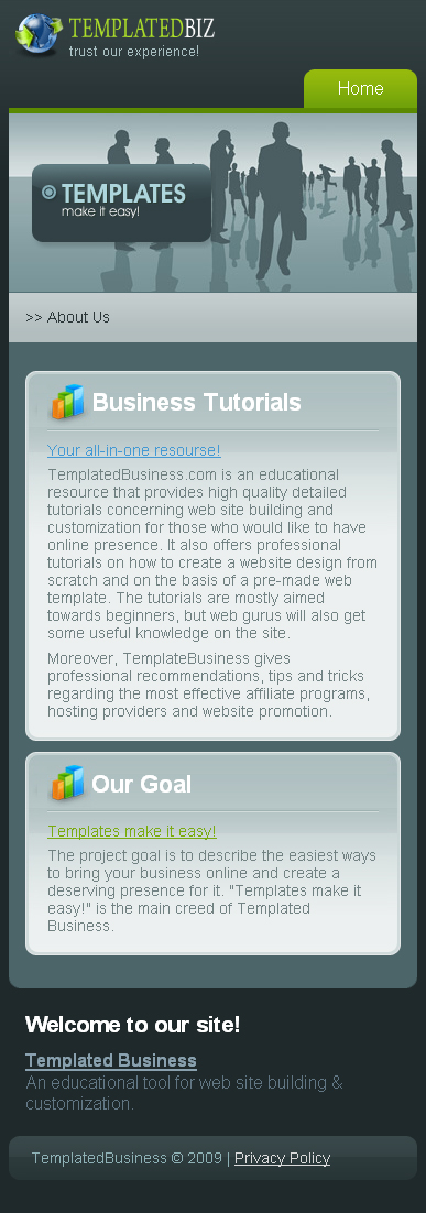
Mobile templates presented at TemplatedBusiness correspond to the portable devices specific demands for the content and representation of information on the Internet and concentrate on the customers' core requirements both in terms of usability and information. Well, my choice is 24139.

It is characterized by special mobile layout and is extremely light-weight (in several times lighter than usual template). It favours fast upload of the website content to the visitor's mobile phone. As you might already notice, this mobile template is arranged vertically, what makes it look perfectly on the small screen. It is compatible with such platforms as Windows Mobile, Blackberry, iPhone, palm and symbian.

After purchase you will find HTML-version and source PSD file of the main page, fonts which are used in the template and some screenshots in the archive.

Template Customization

Now it's time for the template customization. But if you feel that you don't have enough knowledge or time to go though the whole customization process, you may take the opportunity to use Template Tuning services. Here you can order the template customization at an affordable price. Their web developers will easily and skillfully do all the necessary changes for you. But if you are not afraid of difficulties, then let's go on! As it was said above, we will start from the HTML version.

To perform all necessary modifications you will need Adobe Photoshop CS+; Adobe Dreamweaver 8+ or any other HTML editor. Before you start you should install necessary fonts (usually they are placed in "sources/fonts" folder- in this tutorial you'll find more detailed description. After that open .psd file in Photoshop and let's learn how to make the necessary changes.

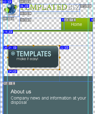
The first thing we are going to do is to modify the template header and a tag line. With the help of Horizontal Type Tool enter your company name instead of the default one and change a tag line. If the slice is not long enough and your site title goes out of its limits, don't worry. You may easily resize the slice. For this choose the Slice Select Tool and highlight the logo (mouse left click + CTRL). By mouse left clicking stretch the slice borders.

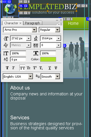
After making all these changes we need to save the customized logo and then replace the existing one. While the slice is still selected, go to "File" -> "Save for Web and Devices". Leave the settings as they are because everything has already been done by a coder. Press the Save button to save files to the Image directory replacing the file company-name.gif.

The next thing that we are going to do is to edit another title on the Home page. Use Horizontal Type Tool.

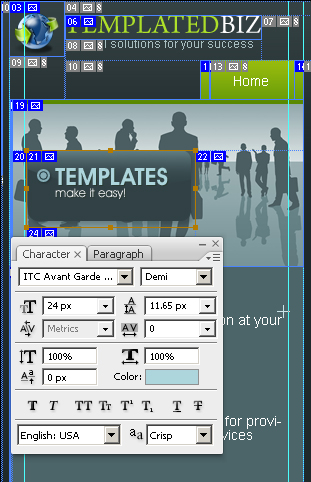
After you make all changes, you should re-save this design element. Make sure you save this slice on the transparent background. For this deselect the background layers visibility and while the slice is still selected, go to File -> Save for Web and Devices. The file slogan.png in the "Images" folder should be replaced.

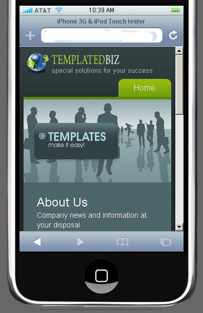
The customization in Photoshop is completed. Before we will go on further, let's check the result. The best way to test the interface is to use Pocket PC (or iPhone, smartphone), but for this you should upload your files on server. You must admit it's rather inconvenient each time when you update file, upload it on server. So, webmasters have found another way to resolve this problem. They prefer to use mobile emulators that offer mobile interface and the ability to navigate websites. That is how my site looks on iPhone 3G tester.

Let's proceed and open HTML editor. Open file index.html and start customizing text. Don't forget to edit your company name in the website footer.

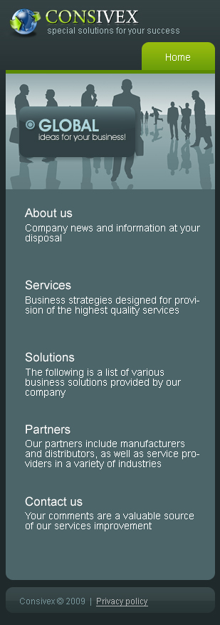
The Home page is ready. Save changes (CTRL+S) and verify the result.

Let's customize the other pages. But before going further, you should define first what parts of the website design you need for your project.
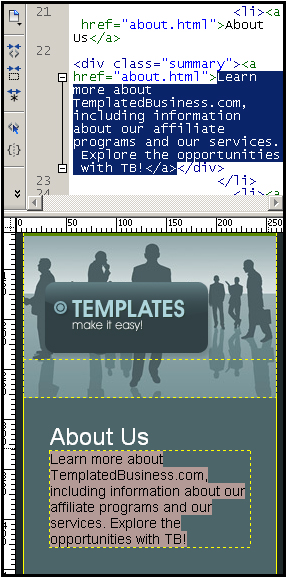
About Us

With the help of HTML editor customize all other texts and footer of this website design. Write down a full description of the products and services your company provides.

The same should be done with the other pages: Services, Solutions, Partners, Contact us and Privacy Policy. All actions should be performed in the same way, so I guess there is no need to repeat what has already been said above.

On the Contact Us page write your postal address and customize the contact form. For contact from implementation you need to have some PHP programming skills and while I don't have them I recommend to order it from TemplateTuning website. They said that it would cost you about $60 - for any type you choose.

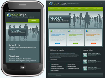
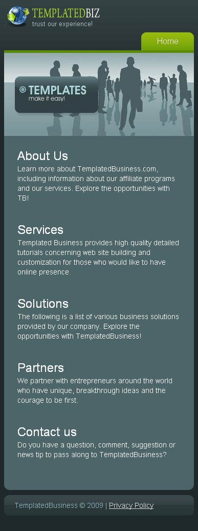
Well, the customization is completed. Take a look at the traditional format of this web design and compare it to the mobile format.

Choosing a hosting provider

When choosing the hosting services you should be guided first of all by other people reviews, prices and quality. On this basis I recommend you webhostingbuzz.com.

If you experience any troubles with registering a domain name or hosting you can always contact TemplateTuning.com professionals.

Website Promotion

You may find a lot of website promotion services all over the Internet. But probably, one of the most reliable among them is website promotion services from Web Design Library. It offers:

- Search Engines Inclusion
- Website Analysis Report
- Keyword Research Report
- Link Building Campaign
- Link Analysis Report
- Search Engine Optimization Report
- Search Engine Rankings Report.

There are two packages:
- Standard package: it would be great for new websites
- Pro package: a complex approach to website promotion.

There is no monthly fee. And by ordering a pro package you will get a 30% discount. Moreover, if you purchase a website template from TemplateMonster.com or TemplatedBusiness, you will get 50% off on the SEO services provided by Webdesign.org. You don't need to learn the secrets of search engines algorithms in order to increase your ranking, because everything will be performed by qualified SEO specialists.

Take my congratulations! From now your website will look perfectly not only on the computer screens, but on your mobile phone as well.

You can visit sample website to see the final result or compare your code.

Apply to be a Chitika Publisher!
Follow on Buzz